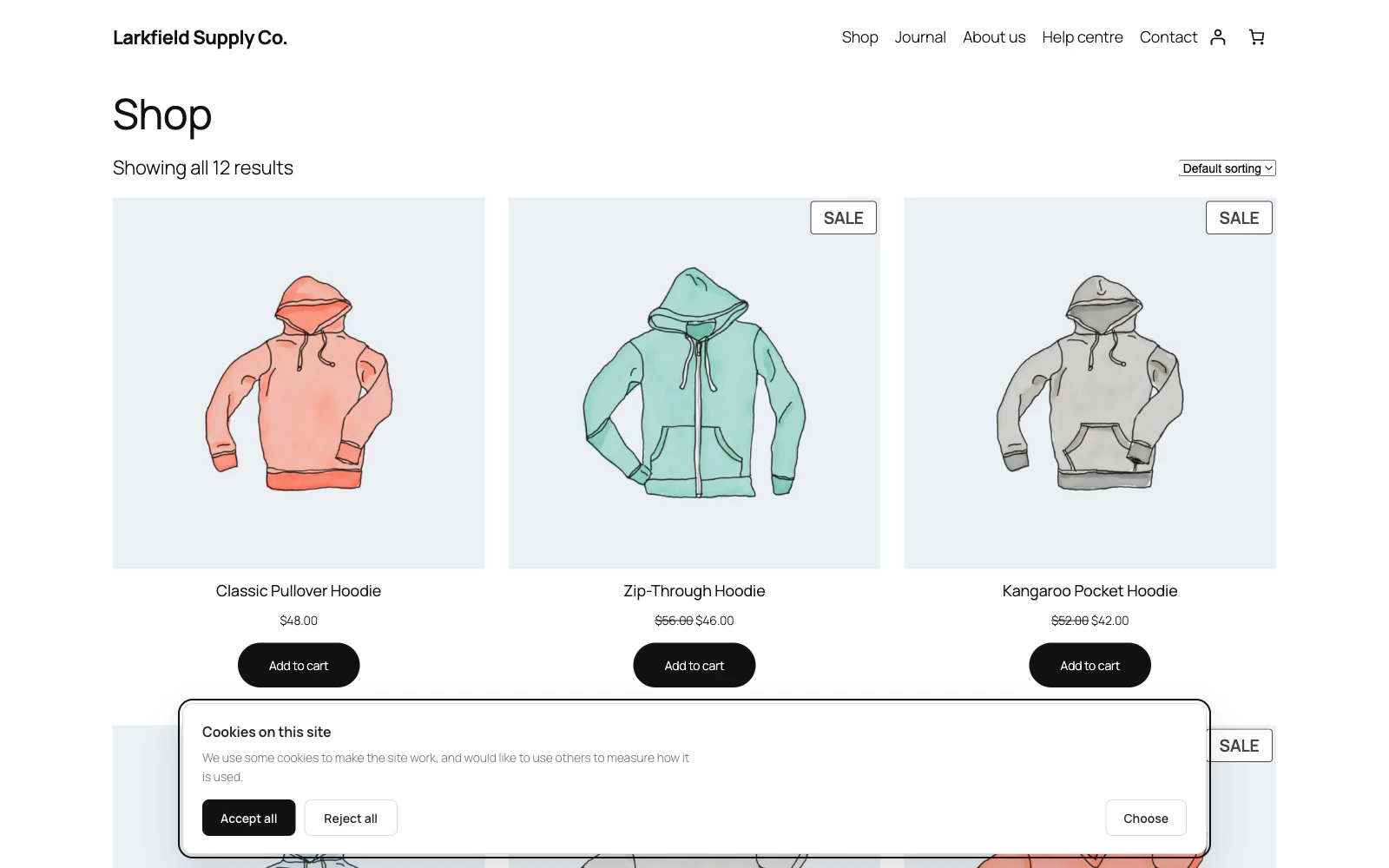
Because that is the thing that gets sites fined.
Nearly every enforcement action taken over a cookie banner has been about the same design: Accept is a big coloured button, Reject is a grey link two menus deep, and consent given that way is not consent. Accept and Reject share one rule in the stylesheet here, so they cannot drift apart, and they are always the same width and height, whatever words you type for them.
Still stuck? Ask the developers who wrote it. We aim to reply within one business day.
 Cookie Consent
Ask before you set a cookie, and actually hold the scripts back until somebody says yes.
From $19 a year · every feature · 30-day refund