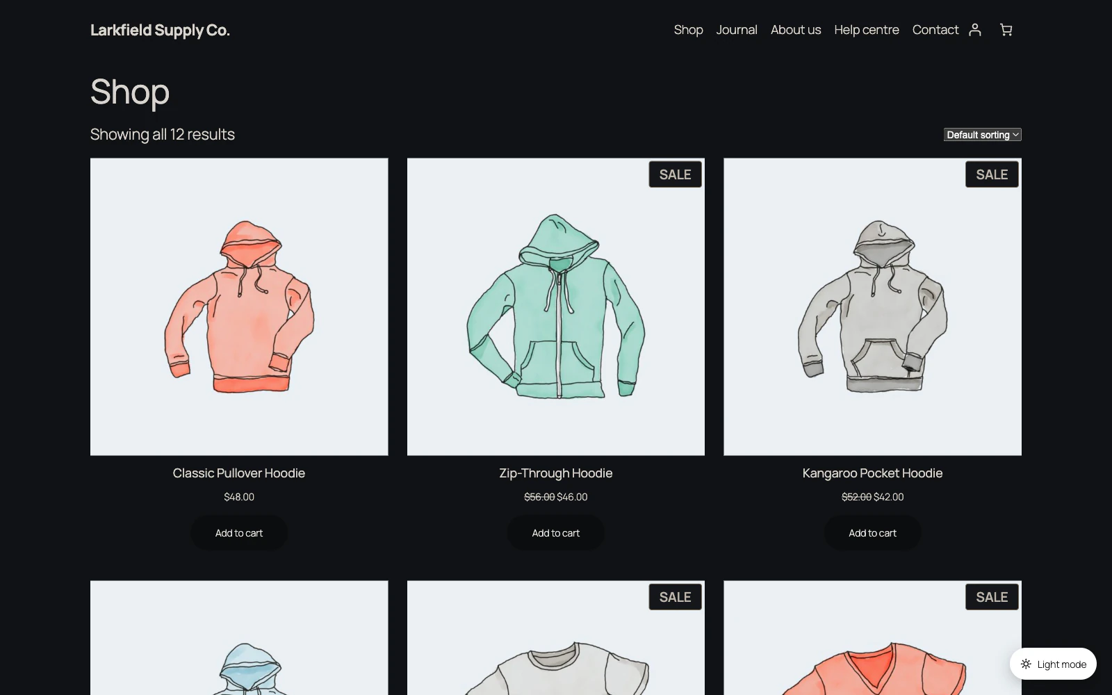
On a dark page the lighter of your two button colours becomes the button, so it stands out from the page. Under the colour pickers, the Toggle Button screen gives the contrast between the icon and the button; keep it at 3:1 or more.
Still stuck? Ask the developers who wrote it. We aim to reply within one business day.
 Dark Mode
Give your site a dark mode your readers can switch on — one that reads properly on every page, without you restyling anything.
From $19 a year · every feature · 30-day refund